Contract builder
Overview
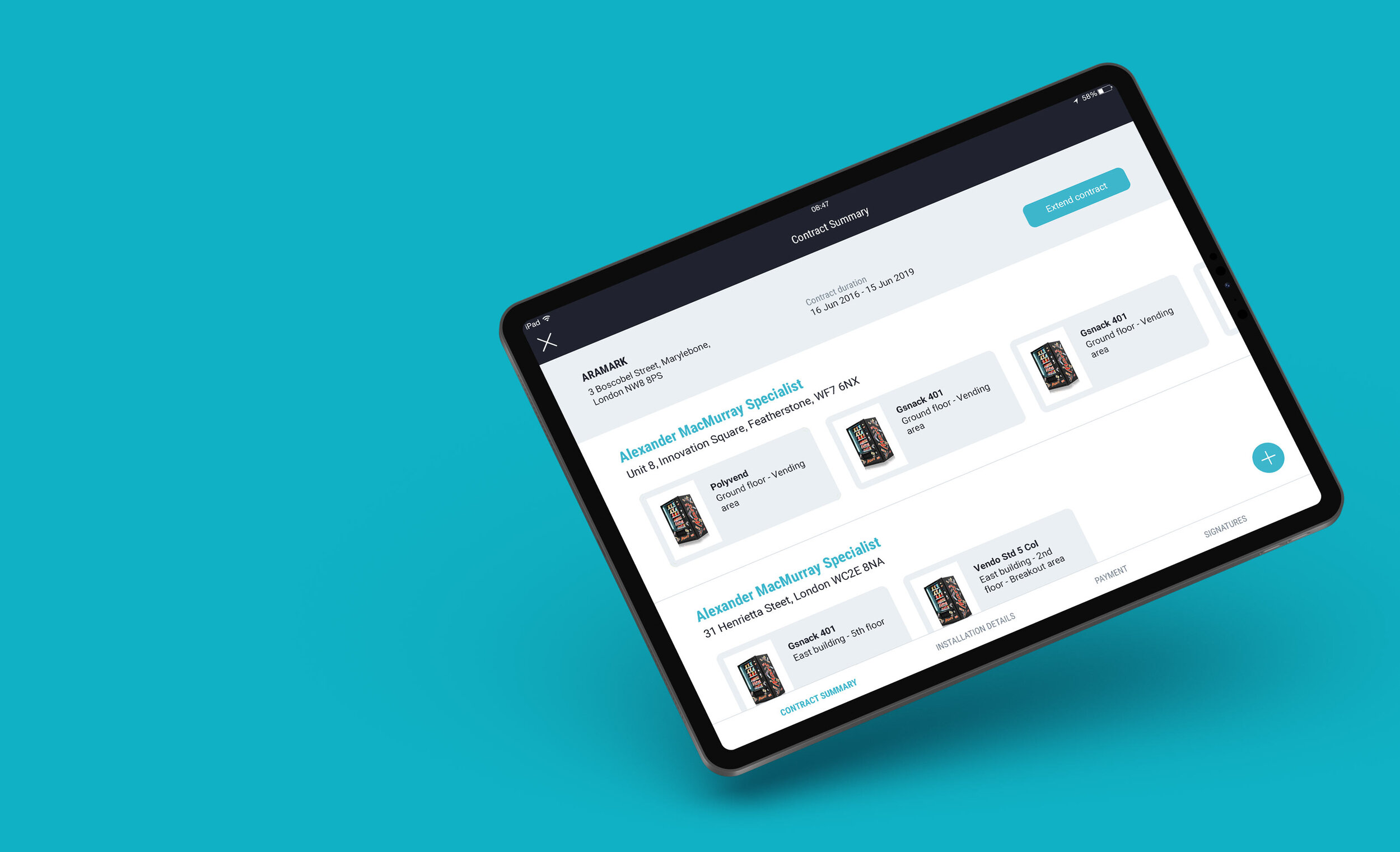
Paperless simplifies the vending machine contract creation process.
Sales Representatives do not need to fill out endless paperwork anymore to create a contract or amend an existing one. They can just sit down with the customer, choose the machine that best fits their needs and choose the products they want for the machine.
Any existing customer info will be accessible within the app making the process quick and easy.
How did I get started?
This project consisted of redesigning our client’s previous vending machine contract builder tool.
The very first steps taken were a field trip and a user survey to find out the following:
Better understanding of users work process.
Which features were not needed or useful?
What could be improved?
What was missing or what actions they were not be able to carry out?
The machine products selection and the app navigation were some of the main issues identified.
First set of wireframes & workflow
The challenges
1. Too many screens can make the workflow complicated, ending up with screens difficult to find or reach. How to make everything accessible with the minimum taps?
The first flow I proposed was linear, guiding users through the steps. But I realised that to carry out changes to the data entered, users would need to go back step by step.
To solve this issue we needed a smarter navigation.
The new flow offers a set of menus that allows users to quickly jump between screens with a simple tap.
To help users with the flow, I added some micro-interactions to guide them through the right path.
2. Improving the products selection.
There are a few ways to top up a machine with the right products:
The quickest way is using the default planograms that the app offers
The second option is customising a default planogram
Finally, the client can choose all the products for the machine
Here is how I improved the customisation process.
The previous tool used part of the screen to display the planogram and the rest of it to display the products available.
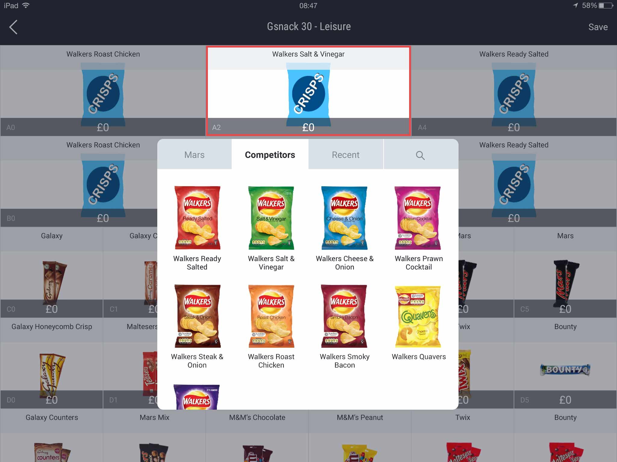
Now the full screen is used to display the planogram and tapping on a particular product will open up the relevant options.
There are multiple tabs grouping the products in a more relevant way. The client can now browse the products available or use the search option when they know exactly what they are looking for.
Pricing the products is also easier and quicker, with the option to price all the products within the same category in one go.
3. This is a heavy content tool. How to fit all the necessary information without compromising the user interface and experience?
To keep the screen clean, I made sure to offer access to the right information at the right time.
I used standard iOS gestures to offer extra actions keeping the screen neat and simplifying the learning process, as users already use them in other iPad apps.
Press & hold over a machine gives users the option to carry out multiple actions for that machine.
The actions that can be carried out for machines that were already in the contract and new added machines are different.
New machines most common actions will be duplicating or deleting the machine.
For existing machines, the most common actions will be changing the machine rental fee or moving the machine to a new location.


